Before reading this post, check out the first four posts! So far, we’ve been introduced to the concept of design principles and the four foundational elements. We discussed scale, enclosure, symmetry/asymmetry, and axis in part 3, and hierarchy, datum, organization, and rhythm/repetition in part 4. Today, we’re discussing texture, above/below, here/there, and threshold.
Texture
The colors involved in a design composition are often the first noticeable feature. I would argue that texture is a close second. While we may not consciously identify the textures of the materials in a design, our subconscious makes note of the textures of our surroundings. Too much variation in texture causes sensory overload, while too little variation is boring.
Textures present themselves in many arenas of design; walls, pavement, plants, and furniture all have texture, as do the existing features of a site like the house itself, existing deck structures, etc. That’s a lot of texture! Flagstone, stone veneer, siding, brick, concrete, wood, gravel…there’s a lot out there, and picking “a little of this and a little of that” can make a design look way too busy and messy. Being selective with what materials you use prevents cluttering the aesthetic of the design. Much in the same vein, it makes the most aesthetic sense to use materials in the same “family;” for example, a natural stacked stone wall pairs better with natural flagstone paving as opposed to pavers.
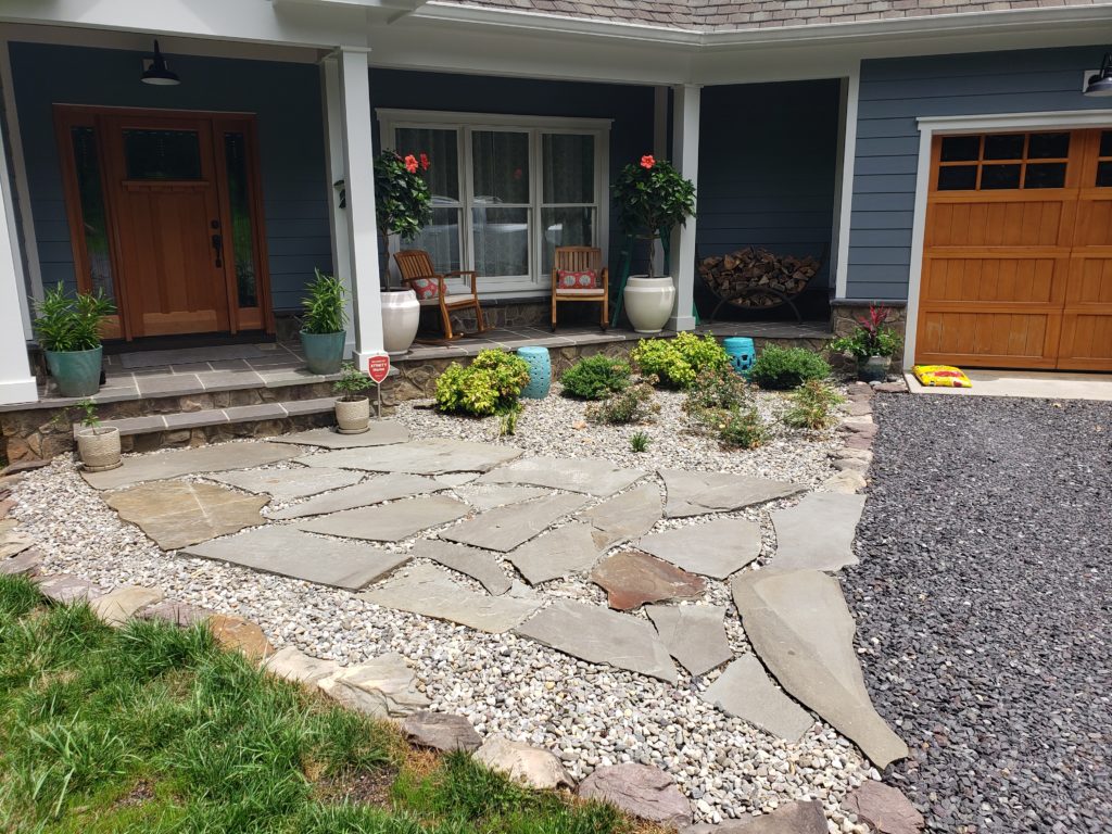
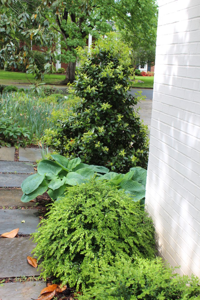
Plant textures are a really fun part of design to consider. This is where you can really go wild with combining different textures. If you aren’t that into plants, you might be thinking “plants are plants. What ‘textures’ are you even talking about?” Aside from the obvious differences between the wider leaves of deciduous plants and the narrow needles of many evergreens, foliage can vary greatly in size and texture. Jagged vs smooth edges, rough vs waxy surfaces, small, medium, large…there is SO much variation in just leaf texture!
In addition to the foliage itself, trees and large shrubs may have smooth or shaggy bark, angular or graceful arching branches, or any other combination of features. All of these things contribute to the perceived texture of a plant. And don’t forget about the seasons. Most plants look different at different times of the year. Consider the texture of the flowers, fruits, branches, trunks…at different times of year, a plant may have an entirely different texture.
Above/Below
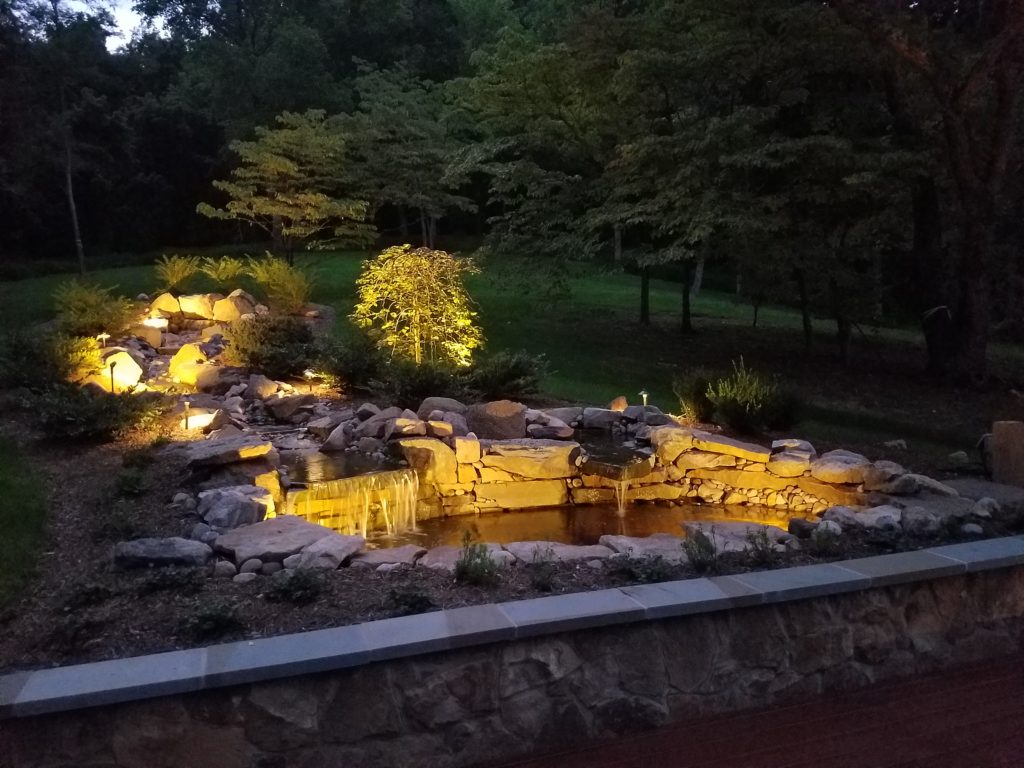
This concept is pretty self explanatory. On any site with noticeable elevation change, you are prone to feel “above” at times and “below” at others. On high points, the sense of being “above” can feel empowering, or, if you’re not careful, you may feel exposed. Being “below,” on the other hand, can make you feel either comfortably nestled or dwarfed by your surroundings towering above you.
This makes grade change an important design consideration beyond just understanding the flow of water or the direction of wind. Stacking tall trees at the top of a steep incline can make you feel trapped when you stand at the bottom of the slope. With steep slopes, low plant material with varying heights help to soften the slope and direct your eye upwards more gently. From an exposed high point, though, it’s still important to provide plants or other features that provide a bit of shelter. Of course, the way you handle grade change depends based on the use of the space. Is your main living and recreating space in the “below” spot, or the “above”? Or do you want to cultivate usable space in both places? These considerations obviously change the way you would handle the design.
Here/There
This is another pretty intuitive principle that’s more experiential. Regardless of what stands between the “here” and the “there”, the point is that you perceive the spaces as separate. Ideally, a well-designed space has compelling elements both “here” and “there” to encourage exploration of the whole site. Conversely, certain cues may establish, for example, that “here” is for exploration, and “there” is to be left alone. This is helpful in public spaces where conservation is a goal, along with recreation. A clearly defined edge between the low grass of a lawn and the lush plantings of a native meadow establishes that the spaces are separate, and only one is to be explored.
Threshold
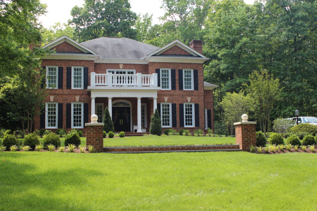
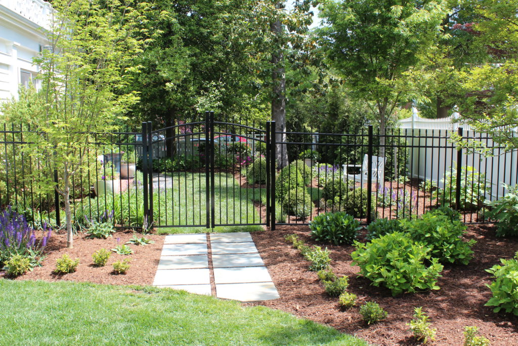
The transitional space between the “here” and the “there” is known as the threshold. Architectural thresholds are easy to identify: they’re doors between rooms, or between a room and hallway. In nature, they can be a bit more ambiguous. Outdoor spaces don’t always have obvious boundaries, but when you pay attention, you can feel it when you transition from one space to another. These transitions may be marked by doorways of sorts, like in the case of an arbor or gate, but they can also be less literal. For example, a buffer area of plants may act as a threshold between two lawn spaces. A threshold can also be indicated with a subtle cue like a change in paving material.
The last post in this series, covering prospect/refuge, panorama, vista, and deflected vista, is available here!
