This is part 3 of a series on basic principles of design. Check out the introduction to the series and this post on point, line, plane, and volume first if you missed them! This week, we’ll be discussing scale, enclosure, symmetry/asymmetry, and axis.
Scale
There are four distinct scales we can identify in built design. They are Intimate, Human, Public Human, and Monumental. These scales can be quantified, but they are easier to identify based on the way that you experience a given space. An intimate-scaled space, typically under 40 feet in any direction, feels comfortable for a small, familiar group. In a human-scaled space (40-80 feet), groups of people can splinter off without encroaching on one another. At public human scale (80-450 feet), facial features can no longer be distinguished and larger crowds can gather. Monumental, the largest scale, describes any space larger than public human. These spaces can also hold large crowds, and they are characterized by a feeling that the space you occupy is larger-than-life.
Scale is important in design for many reasons. Design strategies can be adapted to different scales; however, some are more suited to certain scales than others. Sure, we can bring elements of romantic French villa gardens to your townhouse lawn, but compromises have to be made to scale down such a typically expansive style. The same can be said about scaling up a design precedent. If you’re sitting on 20 acres, that precedent photo you love of a half acre lot gives us a start, but scaling it up requires more than just copy/pasting it over and over.
Another important factor when considering scale in landscapes is the consideration that plants grow. You’re probably thinking “Uh….duh?” Take one look around any number of neighborhoods with houses more than 50 years old, though, and you’ll see that not everyone considers just how much plants will grow. It’s easy for builders to scatter trees around plots of new construction; several decades later, the homeowner reaps the consequences when a storm takes down a gigantic tree limb overhanging their roof.
Enclosure
The four types of enclosure are Intense, Strong, Moderate, and Expansive. Intense enclosure is approximately a 1:1 ratio of width to height, strong represents 2:1, moderate is 3:1, and expansive is at least 4:1 width to height.
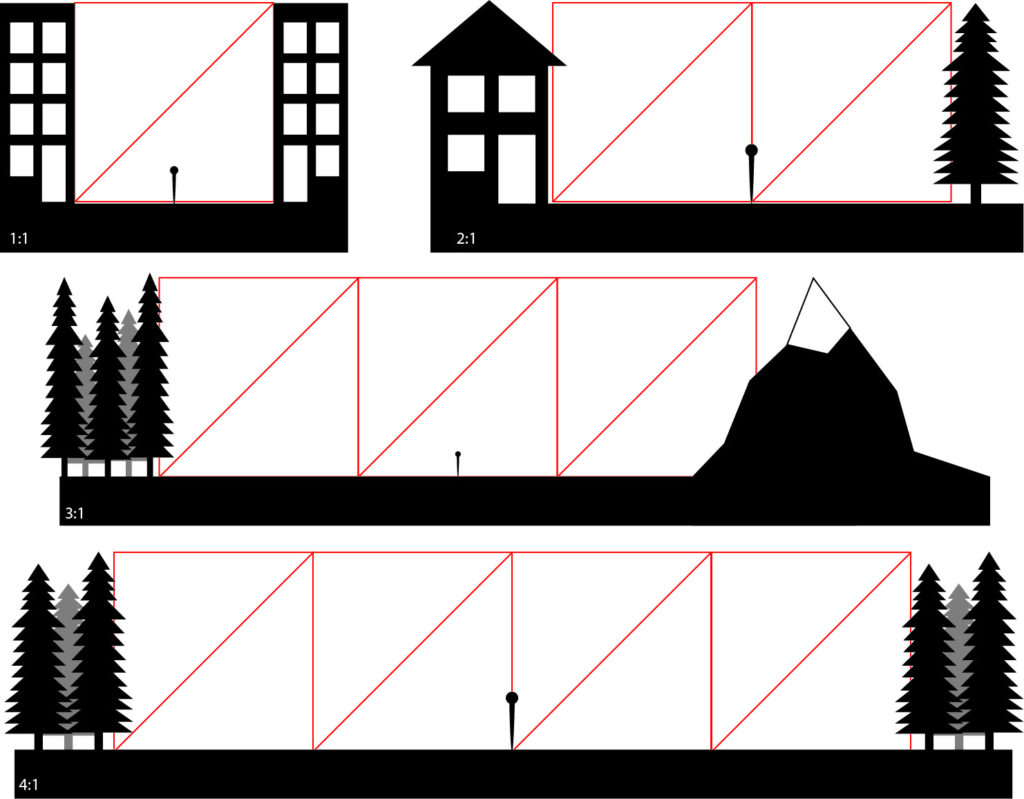
Achieving an appropriate degree of enclosure in a space can make it feel comfortable, but it’s a difficult balance to strike. A design that creates too much enclosure can feel intimidating and dark, and too little enclosure can leave you feeling exposed. Enclosure typically works hand-in-hand with scale to attempt to create the most optimal experience. For example, a small lot could be dwarfed by large trees, while the same trees tucked into the corners of a big open space can help create a cozy atmosphere and block out nosy neighbors.
Symmetry/Asymmetry
In geometry, there are many types of symmetry. In design, the most common types of symmetry are bilateral, quadrilateral, and radial. Bilateral symmetry is the same symmetry found in the human body. With bilateral symmetry, you can draw an imaginary line down the center of a space where one side is a mirror image of the other. Much like the human body, the symmetry of landscapes isn’t ever 100% perfect; however, proper planning can create visual symmetry.
Quadrilateral symmetry is similar to bilateral symmetry, but in quadrilateral symmetry, you can draw two perpendicular imaginary lines, and each quadrant will mirror each other. With radial symmetry, any number of lines can be drawn out at equal intervals from the center, with each “slice” being identical.
When you think of asymmetry, you may think of something that looks crooked or unbalanced. What we’re talking about here, though, is asymmetrical balance. The idea with asymmetrical balance is that we can create an attractive and balanced aesthetic without using symmetry. Designs unified with asymmetry often appear much more dynamic than the typically static symmetrical designs.
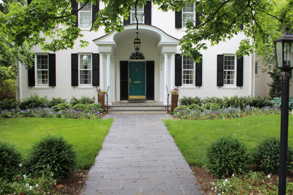
Axis
The imaginary line across which symmetric designs are reflected is known as the axis. One important feature of an axis in a landscape context is that it has a defined terminus, or end point, on each side. Sure, the terminus can be something boring like a fence or the sidewalk edge where your property ends, but this doesn’t take advantage of the strong geometry set up by an axis. Especially on a smaller scale, setting up an axis without a strong terminus can really cheapen the aesthetics of a landscape, in my opinion. In the example above, the door to the house acts as a terminus. This is one example of when I believe an axis is appropriate.
Check out the next four spatial elements in our series, hierarchy, datum, organization, and rhythm/repetition, right here.
Juliette, This makes so much sense! Now, I know why I keep coming back to liking symmetry.