Platanus occidentalis | American Sycamore

The American sycamore (Platanus occidentalis) is one of my favorite trees. Why, you ask? I’ve always had a thing for interesting plant textures, and trees with unique bark always catch my eye. Every child knows how to draw a tree: narrow brown trunk, fluffy green cotton candy-esque leaf canopy. Easy. l If you really stop to look at individual trees, though, you’d be surprised how few trees resemble anything close to that archetype. The sycamore is one such tree.

The artistry! Don’t forget the subtle trunk flare.

Really old sycamores grow massive trunks wider around than my arms can reach (and I’m 5’11, I have very long arms), but even the young ones have the same interesting bark texture. The smooth brown bark exfoliates, no skincare routine required, to reveal splotches of the younger, paler inner bark. On younger trees, this splotchy exfoliating pattern can look almost like camouflage, and sometimes the bark even takes on a pale green color. As sycamores age, this pattern can be harder to distinguish on the trunks, but they can still be easily identified by the same pattern on their heavy, thick branches.

Once you know what to look for, you start to see sycamores everywhere. From forests along the side of highways to residential streets, you can’t miss their striking mottled trunks. Maybe I just like them because even I can identify them with my terrible eyesight. In any case, I love seeing these trees everywhere I go.

If you want to plant one, make sure you leave plenty of room for it to grow. Walking home from class down residential streets of State College was always a great reminder of this, where hundred-year-old sycamore trunks completely fill the several feet of space between the road and sidewalk, in some cases forcing the sidewalk to actually divert around their massive trunks. Of course, you shouldn’t expect that kind of growth within your lifetime, but always be mindful when planting that your landscape will likely outlive you.

Did I pique your interest in planting your very own sycamore? Give us a call today!

Curating a Four-Season Plant Palette: Two Plants for a Pop of Winter Color

I know winter is the last thing on anyone’s mind right now, but if you’re considering planting any shrubs this year, you still need to consider how they’ll look in the winter. When you think of plants with winter interest, you probably think of evergreens. After all, they’re the only plants that aren’t merely bare brown twigs in the cold months, right? Wrong.

Enter winterberry holly (Ilex verticillata) and Red twig dogwood (Cornus sericea). Both of these plants add a nice contrasting pop of red in any landscape. First, let’s talk about winterberry. While most hollies keep their leaves year-round, the winterberry sheds its leaves, revealing branches clustered with tiny, bright red berries. Not only do these berries add a much-needed pop of color in a barren winter landscape, but they also feed the birds that stick around in the winter months.

One thing to keep in mind is that only female plants produce fruit. Luckily, we have access to some amazing female-only cultivars of winterberry like “Red Sprite”, “Sparkle Berry”, and “Winter Red”. In order for these plants to fruit, though, they need a male plant to pollinate them. The general rule of thumb is that you need one male plant for every five female plants. This presents a fun design challenge, because you want these non-fruiting plants to fit into the design year-round without drawing too much attention to their bare branches.

Now let’s take a look at the red twig dogwood. In spring, Cornus sericea has pretty clusters of white flowers, and in the summer and fall it may look like any ordinary deciduous shrub. In winter, though, red-twig dogwood really has its moment to shine. Once the leaves drop, its bright red branches are revealed. These bright red canes look great in front of an evergreen backdrop and stand out against other deciduous trees and shrubs that lack winter interest.

Don’t be fooled into thinking that you have to wait around for springtime to see beauty and color outside your window. Contact us today and we would be happy to design a landscape with a plant palette that’ll keep you smiling year-round!

Edible landscaping

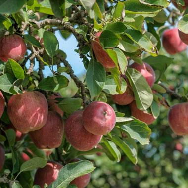
At Revolutionary Gardens, it’s our goal to create outdoor spaces where you WANT to be. One way to ensure our clients interact with the landscape we design for them is to incorporate edible plants. The thing is, anyone can pick up a few blueberry plants and chuck them in their side yard. We see these plants as valuable design features, not just means to a (tasty) end.

From fruit trees and berry bushes to bountiful herb gardens, edible plants can serve you in so many more ways than just providing you with a snack. For example, cherry trees are touted from Washington, DC, to Bonn, Germany, to Japan for their delicately beautiful canopy of pink blossoms in springtime. You can capture that beauty in your own backyard- and end up with enough cherry preserves at the end of the season to feed your whole neighborhood! 

Your edible garden

The fact is- the edible nature of these plants is just one of their many characteristics. A cohesive edible garden design deftly intermingles its edible plants with the rest of the landscape. It considers their blooms, bark texture, shape, size, and all other notable characteristics just as if they were any other plant.

The result isn’t necessarily recognizable as an orchard or an herb garden, per se. Instead, it’s a bountiful landscape that appeals to all of your senses. You see scarlet pomegranate blossoms, hear the buzzing honeybees lazily drifting from flower to flower, smell the nostalgia of a home cooked meal as you run your hands across the soft mats of thyme and nodding rosemary fronds, and yes, you get to eat it all, too.

herb and edible garden in Culpeper VA backyard

As I get older, I realize more and more just how rewarding it is to eat and share a well-cooked meal you’ve prepared with your own hands. Even when the ingredient list was cultivated at the grocery store, enjoying a home-cooked meal with loved ones is something special. Now, when the ingredients themselves are the literal fruits of your own labor, that feeling is amplified tenfold. In this way, edible gardens really are a gift that keeps on giving. 

Let us do the heavy lifting to give you the edible garden of your dreams! Reach out and we can work together to design something perfect for your needs.

Studying Landscape Architecture in Barcelona, Spain

Since I was young, my parents have always been big advocates of traveling. When I was 5 years old, for example, my dad had to take a business trip to France. He decided to turn it into a family vacation. It was February, and I was allowed to drink all the hot chocolate I wanted under one condition: I had to order it myself, in French. They taught me to say “Je voudrais chocolat chaud, s’il vous plaît” and trust me, I took advantage of that any time we sat down at a restaurant or passed a street vendor. Their perspective towards travel as not just a leisurely pursuit but also an opportunity to learn persists today, and it had a huge influence on me.

Je voudrais chocolat chaud, s’il vous plaît!

When I chose to attend Penn State for landscape architecture, the program’s pitch included many chances to go abroad. If you haven’t read my first post on studying landscape architecture at Penn State, there are more details there! During my third year, I elected to spend the summer in Barcelona, Spain along with about half of my classmates. Penn State has a relationship with a small school based in Barcelona called the Barcelona Architecture Center, or BAC. The BAC works with numerous universities, bringing students from schools across the US to study throughout the year. Penn State’s program specifically is a 6 week intensive program, held every summer.

Landscape design: Two approaches

Before I go into the details of my experience in Barcelona with the BAC, I’d first like to explain a bit of the difference in philosophy between the US and Europe in terms of landscape design. In the US, landscape architecture is a recognized profession, where people such as myself learn about a variety of topics, ranging from design and planning to planting and climate. To call yourself a “landscape architect,” you must take and pass official licensure exams that contain both general knowledge and information specific to the region where you are being licensed. For example, flood-prone states may include a section on floods in their exam, while northern states may have a specific section dedicated to designing for the freeze-thaw cycles of northern soils. This approach makes American-educated landscape architects more generalists than specialists: we can talk to contractors about our technical drawings or botanists about plants, but we aren’t typically experts in any one subject. That is, of course, unless we choose to pursue additional degrees in your area of interest (which many landscape architects do).

In Spain, as with much of Europe, “landscape architecture” isn’t really a thing. Most landscapes are designed, layout-wise, by architects, with the help of plant specialists and others who may have a better understanding of elements an architect hasn’t learned. Many landscape architects in the US have a negative perception of architect-designed landscapes. Some believe that without training regarding plants, architects treat plants like any old inanimate feature, scattering them around to “make it look pretty.” Parts of this criticism are true: architects aren’t taught about biodiversity, benefits of planting native species, or the sunlight or water requirements of specific plant species like landscape architects are. This can lead to a less informed approach to planting design that doesn’t fully take advantage of the amazing palette of plants with which designers have the opportunity to work.

In the European system, though, these considerations are undertaken by experts in those fields, who apply their knowledge to a layout planned by an architect. Obviously, architects are highly qualified in terms of spatial organization and layout design. While I obviously don’t have experience working in this kind of system, I can still see how there could be issues when splitting up this work between multiple people. In my opinion, there isn’t one “better” way to do it, although I am obviously biased towards thinking my education and particular skillset are beneficial to the design world.

Arrival

When I arrived in Barcelona, I had never traveled internationally by myself before. I didn’t know any Spanish beyond the VERY basics, and the only instruction I had was where to catch the bus from the airport to the center of the city, and how to get to my dorm from the bus drop-off. It was hot, and I was sweating as I disembarked the bus in Plaça de Catalunya, dragging my suitcase laboriously down the bumpy cobblestone sidewalks of La Rambla, but I was excited for the adventure ahead of me. Once I was moved into my room, I met up with some of my classmates and we got accustomed to the neighborhood that would be our home for the next six weeks, exploring the nearby shops, cafes, and bars. 

Our second day there, we had a welcome party at our professor’s office. Located in the Eixample area of the city (more on Barcelona geography later), the office was converted from a 150 year old home into a beautiful workspace. Our party took place on the lush, expansive patio located in the courtyard of the block. Neighbors on their balconies overlooking the courtyard played music and hung laundry out to dry. While I knew that I would have a lot of work to do and a lot to learn, this relaxing introduction to life in Barcelona encouraged me that the experience along the way would definitely be unforgettable.

When our classes began, we followed a mostly regular schedule, with trips and activities built in. Most class days we were in the BAC studio for at least 8 hours. We had history lessons once or twice a week and spent much of the rest of the time learning about our studio site and developing our studio projects. We had a series of walking tours of Barcelona landmarks, and once a week we would take a day-long field trip to another Catalan city to gain perspective on the wider context of Catalan design, culture, and experience.

History

The history of Barcelona is very interesting, and the lessons we got always enriched my experience while walking around observing the city around me. Most of the Old City of Barcelona is actually built directly on top of the ancient city. The neighborhoods of El Raval, Barri Gothic, El Born, and La Barceloneta compose the Ciutat Vella (or the Old City). In 1859, Ildefons Cerdà developed the plan for the expansion of the city, following his theories of urbanization. The Cerdà plan sought to address issues posed by the structure of the Old City. Since until that point the city grew quite organically, its roads were narrow, winding, and confusing. This resulted in a dense labyrinth where many of the city’s inhabitants lacked access to public services and often even sunlight.

The Cerdà plan proposed an expansion radically different from the existing urban fabric. The expansion, or “Eixample” neighborhood, consists of wide streets laid out in a highly legible grid. Each block’s corners are cut, or chamfered, at a 45 degree angle. This further opens the intersections to receive plenty of sunlight and enhance visibility around corners. Each block also is designed with an interior courtyard, like the one where our welcome reception was held. The Ciutat Vella and Eixample are easy to differentiate on maps, like the one below, thanks to their extremely different structures. Notice also that Eixample connected the city to surrounding municipalities like Gràcia, incorporating them into the city of Barcelona. You can tell that these areas are older than Eixample by their fine-grained structure, more similar to the Ciutat Vella than the newer Eixample.

All maps of Barcelona are rotated about 45 degrees east, so the Gran Via runs horizontal and the Mediterranean Sea is at the bottom of the map.

Since 1859, a lot has happened and changed in the city. The Parc de la Ciutadella was designed for the 1888 World’s Fair. Many aesthetic improvements were made to the city in advance of this major global event. Unfortunately, other changes that have transpired since this time include the infill of most of the courtyards of Eixample to accommodate increased population and the introduction of cars into the city. In recent years, “urban voiding” has sought to restore some of these spaces, but the full potential of these areas as green oases still remains unrealized.

Antoni Gaudí

Of course, any discussion on Barcelona, especially from a design perspective, would be incomplete without mentioning Antoni Gaudí. Our curriculum took us on tours of many of the Catalan Modernist’s most famous works. These include Casa Batlló, Park Güell, Casa Milà, and of course, La Basílica de la Sagrada Familia.

Gaudí took inspiration from nature, rejecting the straight lines of more traditional styles of architecture in favor of more natural shapes. Gaudí’s designs mimic the gentle, imperfect curves of trees, landforms, and even structures of the human body, like our bones. He practiced during a time of “rebel architecture,” where Catalan architects dotted the landscape with daring works that embraced the free and independent spirit of the Catalan identity. One striking example of this period of architecture is the so-called “Block of Discord.” Located on the luxurious Passeig de Gràcia in Barcelona, this block is home to many revolutionary works of architecture, the three most notable of which are Lluís Domenech i Montaner’s Casa Lleó Morera,  Josep Puig i Cadafalch’s Casa Amatller, and Antoni Gaudí’s Casa Batlló. These remarkable buildings were originally designed as homes. When these works were built around the turn of the twentieth century, Passeig de Gràcia was the place to “see and be seen,” where the wealthy elite would meet up and people-watch. Today, these eye-catching architectural works are surrounded by high-end shops.

Field Trips

Aside from touring architectural wonders in the city of Barcelona, the curriculum took us on trips across Catalonia. We toured the cities of Lleida, Tarragona, Olot, and Valencia and explored other marvels like Salvador Dalí’s home in Port Lligat. These study tours included guided walks, guest lectures, and sometimes even bike tours. On each trip, we would all gather for a big group lunch, too. I feel that the immersive nature of these experiences taught much more than I ever would have gleaned from sitting in a classroom.

The view from Casa-Museu Salvador Dalí: Dalí’s home-turned-museum, featuring an olive grove overlooking Port Lligat.

On our field trips, we were exposed to the works of many Catalan architects like Toni Gironès and RCR Arquitectes. These designers use materials like corten steel, juxtaposed sharply against natural landscape elements, to dramatic effect. Works like theirs emphasize my disagreement with those who think architects cannot design landscapes; while they do focus more on built forms than other landscape designs, they are notable in their minimalism and restraint. The designs are, to me, monuments of respect for the landscape; they aim to emphasize and complement the existing natural forms rather than dominate them.

In addition to studying these contemporary designs, we also learned about historical Catalan design. We toured centuries-old churches in Tarragona, Valencia, and Lleida, as well as historic gardens in various Catalan cities. On our trips, we learned about not just the contemporary attitude towards design, but also when and how each place we visited was established, and how each location evolved over time. In general, European landscapes contain much deeper recorded history than American ones, so I really appreciated these insights into long-term evolution of cities.

Lleida’s Seu Vella, built in the 18th century, was built atop a hill in the center of the city.

My Studio Project

Clearly, this experience wasn’t like the typical semester of my schooling, where our studio project was the absolute most important thing, the be-all end-all, make-or-break element of our semester. That said, the project we were given was the perfect way to synthesize all our other learning experiences. Our project site layered the historical and contemporary, as a perfect microcosm of the city. At its most basic, our site, which was located in the Barri Gothic, consisted of two public plazas separated by an elevated garden. There is much more than this below the surface (quite literally, but also figuratively). The northernmost plaza on-site hosts a playground frequented by local children, and the southern plaza is the site of a popular mosaic art piece called “El Món Neix en Cada Besada” (“The World Begins with Every Kiss”). The mural is mounted on the wall of the elevated garden that separates the plazas. Both plazas also have areas designated for outdoor eating spaces for restaurants abutting the space.

Now, I mysteriously mentioned “much more below the surface.” I also mentioned earlier that most of the Old City of Barcelona is built on top of the ancient city, so you may already be connecting the dots here. That’s right: our project site contains buried artefacts which have been identified and catalogued by archaeologists, buried right beneath the plaza! Not only is there history beneath the site; the northern plaza is also enclosed on one side by a wall built directly around one of the original aqueducts into the ancient city. If you look closely at the photo above, you can see the archways of the aqueduct built into the wall. Our design challenge, then, was to synthesize the temporal layers: the ancient and contemporary, as well as the physical layers: underground artefact level, plaza level, and elevated garden level. It’s a lot to work with, but I’ll show you what I was able to come up with.

Site plan
Site Section

My design hinged on the concept of “deconstruction.” This concept is multifaceted; not only did I desire to deconstruct the physical forms found on the site, but I also wanted to deconstruct their connotations and incorporate all the elements into equitable, accessible public space. On the existing site, the elevated garden was privately owned by the building adjacent to it, and was only accessible from inside. Historically, these elevated gardens were established for the wealthy class to have outdoor space that was separated from the public space around it. My design aims to reduce the scope of this private space, and instead mimics its form in multi-level public gardens. As the site is laid out currently, the elevated garden separates the plazas almost completely, leaving only a narrow corridor connecting the spaces on either side. My new design reduces the size of the garden by about half, opening more space up to the public.

My design incorporated multi-level public gardens across the site while reducing the footprint of the private garden.

Another goal of my design was to deconstruct the concept of archaeological relics in two ways. First, I proposed a reflective pool beneath the aqueduct wall to emphasize it, and to represent the idea that relics like it are found beneath the surface of the city. I also moved an existing fountain to this space to reflect the historical use of the aqueduct symbolically. Additionally, I proposed a large sandbox, adjacent to the private elevated garden, where children can “dig” for imitation relics directly above where real relics have been identified. The goal of these design elements is to remind Barcelona natives as well as visitors about the origins of the city, buried underground.

In addition to these features, my design also includes “deconstructed” arch forms that mimic the arches of the aqueduct. These features divide the different spaces of my design and visually reinforce the concept of deconstruction. My idea was to build gabion arches and fill them with the material removed from the site during construction.

One critique I received of my design during our final review at the end of the program was that I didn’t really do enough to represent “deconstructed” forms in the design. I agree with this assessment; I certainly could have taken the concept further, designing the forms of the gardens and archways to appear as if they are crumbling, or modifying the layout to push the concept further. Of course, any designer worth their salt will tell you that no design is ever REALLY done- there’s always another iteration, another concept, another way to elevate it further. For the duration of the program and how much else I learned and experienced in that time frame, I am very happy with my concept and the level of development I reached.

Overall, I wouldn’t trade the six weeks I spent in Spain for anything. I’ll always remember the people I met, the places I saw, and the lessons I learned (oh, and did I mention the tapas and wine?).

Until next time, Barcelona!

Principles of Design: Prospect/Refuge, Panorama, Vista, and Deflected Vista

This is the last part in a series on basic principles of design. We made it! Check out the intro, part 2, part 3, part 4, and part 5 if you haven’t already, then get ready to dive into today’s topics: prospect/refuge, panorama, vista, and deflected vista. These final four principles are a bit more conceptual than most of the others we’ve discussed, but once we understand them, we’ll be equipped with all the necessary vocabulary to effectively study and discuss designed spaces!

Prospect/Refuge

This concept is quite abstract, but it is very important. The idea of prospect/refuge appeals to our basic human need to feel safe. In Maslow’s Hierarchy of Needs, safety and security are among the most basic human needs, only after basic physiological needs like food, water, and shelter.

Only when all needs lower in the hierarchy are met can one aspire to or attain needs higher on the pyramid.

In the most basic terms, “prospect” describes looking, and “refuge” describes the feeling of being sheltered. Think about the last time you were people-watching. Maybe you didn’t have a choice where you could sit, but if you did, I’d bet you chose a spot towards the edge of the area you were watching. An abundance of research has been conducted on the theory of prospect/refuge, and (good) designers consider this innate human need when trying to make comfortable spaces. The next time you’re in a public space, look at what seats are occupied and which are empty. It is most likely that the edges of the space, where people can observe while feeling protected, fill in much quicker than more exposed, central spaces.

Prospect/refuge relates heavily to many of the topics we have discussed throughout this series. For example, being “below” as opposed to “above” makes it easier to feel safe, with your back protected by the slope. Scale also relates to the feeling of safety, with it being much easier to feel safe in a smaller space. In larger spaces, prospect/refuge must be designed more intentionally.

This kousa dogwood and the shrubs in front of it provide a secure feeling while sitting in chaise lounges in front of the planting bed.

Panorama

The final three principles deal with views. The first, panorama, describes a wide view. We all know what a panoramic view looks like; whether it be a waterfront, a mountaintop, or a simple clearing on a hill, we’ve all seen a larger-than-life view that takes our breath away. In design, it’s important to respect such a valuable feature. When you’re given a space with an amazing view, it is your responsibility as a designer to do justice to the view, attractively framing it rather than blocking it out with unnecessary obstructions.

This client has an absolutely amazing panoramic view.

Vista

A vista is a type of view that is more restricted than a panorama. It still includes an attractive and deep field of sight, but foreground features focus the view through a smaller window than is available when viewing a panorama. Incorporating a flowering tree or another framing feature compliments a vista nicely. Obviously, since the view of a vista is already partially obscured by the foreground, designers must be careful to avoid blocking any more of the precious view. Additionally, distracting focal points in the foreground and midground may detract from the view. Instead, care should be taken to direct the eye out towards the vista.

These hornbeams frame the view at Asheville’s North Carolina Arboretum. Changing the distance between you and the framing elements restricts and expands the view beyond.

Deflected Vista

When I first learned about deflected vistas, I thought the terminology was a bit weird. If a vista is a narrowly framed view, then what is the deflected version? As it turns out, a deflected vista is one where most or all of a view is obscured or hidden around a curve. A deflected vista makes you pause and think “huh, I wonder what’s around that corner”. Cultivating this mysterious atmosphere can be difficult to achieve, but when you successfully guide someone in this way, the payoff is huge. Imagine a hike where you’re reaching the top of the hill, but the trees are too dense to see what’s around you. You reach the top, round a corner, and suddenly you’re met with an amazing view over the surrounding valleys. The sudden, unexpected view is more memorable than one you can see glimpses of throughout the whole hike.

In a smaller context more relatable to residential design, the importance of a deflected vista is its ability to cultivate a sense of mystery. A subtle curve that obscures what’s beyond inherently sparks our curiosity. The curve also provides refuge for those beyond it, contributing to the ability to create prospect/refuge.

The curve of these planting beds obscures the full view of the patio beyond, contributing to an air of mystery.

Conclusion

Thanks so much for tuning in over the past six weeks to learn about basic principles of design! I hope that you feel better equipped to actively engage with the world around you, prepared with the vocabulary to describe what you see. When you really stop to look around, you can gain so much more appreciation for your surroundings than you previously had. When I first learned these design principles, I began to see the world around me totally differently. Even places I had seen a hundred times before gained a new meaning, and I felt more connected to the things I was seeing, and the people who designed them that way.

Principles of Design: Texture, Above/Below, Here/There, and Threshold

Before reading this post, check out the first four posts! So far, we’ve been introduced to the concept of design principles and the four foundational elements. We discussed scale, enclosure, symmetry/asymmetry, and axis in part 3, and hierarchy, datum, organization, and rhythm/repetition in part 4. Today, we’re discussing texture, above/below, here/there, and threshold.

Texture

The colors involved in a design composition are often the first noticeable feature. I would argue that texture is a close second. While we may not consciously identify the textures of the materials in a design, our subconscious makes note of the textures of our surroundings. Too much variation in texture causes sensory overload, while too little variation is boring.

Textures present themselves in many arenas of design; walls, pavement, plants, and furniture all have texture, as do the existing features of a site like the house itself, existing deck structures, etc. That’s a lot of texture! Flagstone, stone veneer, siding, brick, concrete, wood, gravel…there’s a lot out there, and picking “a little of this and a little of that” can make a design look way too busy and messy. Being selective with what materials you use prevents cluttering the aesthetic of the design. Much in the same vein, it makes the most aesthetic sense to use materials in the same “family;” for example, a natural stacked stone wall pairs better with natural flagstone paving as opposed to pavers.

Even with a limited palette of materials, slight variation in color and texture can still effectively divide space.

Plant textures are a really fun part of design to consider. This is where you can really go wild with combining different textures. If you aren’t that into plants, you might be thinking “plants are plants. What ‘textures’ are you even talking about?” Aside from the obvious differences between the wider leaves of deciduous plants and the narrow needles of many evergreens, foliage can vary greatly in size and texture. Jagged vs smooth edges, rough vs waxy surfaces, small, medium, large…there is SO much variation in just leaf texture!

In addition to the foliage itself, trees and large shrubs may have smooth or shaggy bark, angular or graceful arching branches, or any other combination of features. All of these things contribute to the perceived texture of a plant. And don’t forget about the seasons. Most plants look different at different times of the year. Consider the texture of the flowers, fruits, branches, trunks…at different times of year, a plant may have an entirely different texture.

For planting plans with varied foliage texture, I love hostas. Their large, smooth leaves contrast brilliantly with almost any other plant texture: evergreen, deciduous…it doesn’t matter.

Above/Below

This concept is pretty self explanatory. On any site with noticeable elevation change, you are prone to feel “above” at times and “below” at others. On high points, the sense of being “above” can feel empowering, or, if you’re not careful, you may feel exposed. Being “below,” on the other hand, can make you feel either comfortably nestled or dwarfed by your surroundings towering above you.

This makes grade change an important design consideration beyond just understanding the flow of water or the direction of wind. Stacking tall trees at the top of a steep incline can make you feel trapped when you stand at the bottom of the slope. With steep slopes, low plant material with varying heights help to soften the slope and direct your eye upwards more gently. From an exposed high point, though, it’s still important to provide plants or other features that provide a bit of shelter. Of course, the way you handle grade change depends based on the use of the space. Is your main living and recreating space in the “below” spot, or the “above”? Or do you want to cultivate usable space in both places? These considerations obviously change the way you would handle the design.

This water feature gracefully spills down the hillside. Instead of using gigantic boulders and overbearing shrubs, the plants gently step up in size as you ascend the hill.

Here/There

This is another pretty intuitive principle that’s more experiential. Regardless of what stands between the “here” and the “there”, the point is that you perceive the spaces as separate. Ideally, a well-designed space has compelling elements both “here” and “there” to encourage exploration of the whole site. Conversely, certain cues may establish, for example, that “here” is for exploration, and “there” is to be left alone. This is helpful in public spaces where conservation is a goal, along with recreation. A clearly defined edge between the low grass of a lawn and the lush plantings of a native meadow establishes that the spaces are separate, and only one is to be explored.

This step and its surrounding plantings create two distinct spaces. The space from where this photo was taken is clearly identifiable as the “approach” while the other side is squarely defined as the main lawn area. This shrinks an otherwise dwarfing lawn expanse.

Threshold

The transitional space between the “here” and the “there” is known as the threshold. Architectural thresholds are easy to identify: they’re doors between rooms, or between a room and hallway. In nature, they can be a bit more ambiguous. Outdoor spaces don’t always have obvious boundaries, but when you pay attention, you can feel it when you transition from one space to another. These transitions may be marked by doorways of sorts, like in the case of an arbor or gate, but they can also be less literal. For example, a buffer area of plants may act as a threshold between two lawn spaces. A threshold can also be indicated with a subtle cue like a change in paving material.

It is easy to see that the gate itself is a threshold; however, I would argue that the entire planting bed area acts as a threshold from lawn to lawn.

The last post in this series, covering prospect/refuge, panorama, vista, and deflected vista, is available here!

Principles of Design: Hierarchy, Datum, Organization, Rhythm and Repetition

This is part 4 in a series on basic principles of design. If you haven’t read the previous posts, check them out! After a brief introductory post, we dove into the four main spatial components, then touched on scale, enclosure, symmetry/asymmetry, and axis. This week, we’re looking at hierarchy, datum, organization, and rhythm/repetition.

Hierarchy

Hierarchy is one of my favorite spatial design components. Okay, that sounds super nerdy. But hierarchy is a great example of the ways our brains subconsciously perceive the world around us. In writing, we can create hierarchy by making things bold or italic. Text size, too, can add hierarchy to an otherwise uniform block of text. Scroll through this post and notice that the headings are larger than the body text, and the title is larger than that. This is a very straightforward example of hierarchy.

In landscapes, hierarchy can be obvious, but it can also be much more subtle. Hierarchy is an important visual cue that we constantly use subconsciously to navigate. For example, a building with a facade full of archways may have a larger or higher arch where the main entrance is. Other ways to establish hierarchy in landscapes include proximity, spacing, alignment, and use of negative space. Dense plantings may thin out to reveal an important feature, for example, or a swath of lawn may set off a focal point.

The white stone border surrounding the path establishes it as separate from the expanse of the parking lot. Without changing the actual ground material, the addition of this border gives hierarchy to the path- we can tell it’s more important than the rest of the stone area. We look at this and subconsciously think “Hmm…I should probably walk that way.”

Datum

A datum is an element that is repeated across a landscape to create unity. A datum may be a material, a shape, or any other recognizable and repeatable element. In public spaces, a specific material may be used to denote important places or features, or a specific aesthetic may be used for all signage in an area. Much like hierarchy, a visual datum can be very important for wayfinding in public places. In a residential design, unity can be created by using the same material in multiple places, like a copper roof on a pergola coordinating with copper fixtures in an outdoor kitchen. Additionally, repeated pavement inlays or similar curves appearing in different places can also create unity.

I can identify two datums (data? I don’t know, I just work here) in this photo. First is the use of circles, and the second is the use of brick. The repetition of circles and the repeated use of brick to define different spaces unifies this design- even before the plantings go in.

You can see from the example above that the datum needn’t be used in the exact same way everywhere it is used. The patio has an area defined by a brick border inlaid in the flagstone, while the path looping around the tree is made entirely of brick. We could relate this back to the discussion of hierarchy. The brick border gives the circular space hierarchy over the rest of the patio, and the entirely different use of brick on the path defines it clearly as its own space rather than just an extension of the patio.

Organization

The term organization is pretty generic. After all, many of the other elements we have discussed, such as symmetry, could be referred to as organizational systems. In this section, though, we will specifically focus on regular vs irregular organizational structure. Regular organization, or laying things out in a grid, creates a very uniform pattern. The geometry of a grid is very easy to identify; its criss-crossed parallel lines stand out boldly against almost any context. 

This is a great example of the strong geometry grids create. This parking area and step landing are set up on a grid, rotated 45 degrees from the house.

Grid organizations can sometimes get boring. In the example above, the walls of the house itself set up a grid of their own, and the parking and entry area are designed in their own grid. This is much more striking and dynamic than if the landscape grid was merely an extension of the geometry set up by the house. Picture a landing area square with the front stoop, and cars parked perpendicular to the house wall in the background. That’s way more boring, right?

Another organizational structure is clustered, or irregular. Much like our discussion on symmetry and asymmetry in last week’s post, I want to emphasize that things with clustered organization are still organized, they just aren’t spaced evenly like features of gridded layouts. A benefit to clustering vs gridding is the ability to create inherently more dynamic landscapes. Just like how symmetric designs can look static, incorporating clusters of plants or other features to vary the aesthetic of a design creates visual movement.

Rhythm and Repetition

Rhythm and repetition are more experiential design elements. The rhythm of a space can really only be felt by walking through it. The repetition of elements, either in regular or irregular fashion, establishes the rhythm. As you can probably tell, rhythm and repetition are closely related to organization. A grid-like organization inherently has regular rhythm, for example. Clustered organizations lend themselves more to irregular rhythm. The rhythm is partially based on what you see as you move through a place, but it can also describe the actual way in which you move. Think about how easy it is to walk through an orchard. The trees are neatly arranged in rows, with nice straight aisles to walk down. Now compare that to navigating the woods. Here, you are forced to slow down as you weave around the trees.

In terms of design, the “orchard vs woods” example illustrates pretty clearly the drawbacks of designing to either extreme. Orchards are lovely, but that strict grid form doesn’t apply so well in a residential design setting. The wild irregularity of the woods, too, is fantastic for a hike, but probably a bit too untamed to emulate in your backyard.

While these tiered walls aren’t all the exact same height, there is a visual regularity to their appearance. This creates a clean, uniform aesthetic that is often ideal for built forms like walls. You walk up or down the steps in a regular rhythm.

Check out the next post in the series, all about texture, above/below, here/there, and threshold.

Principles of Design: Scale, Enclosure, Symmetry/Asymmetry, and Axis

This is part 3 of a series on basic principles of design. Check out the introduction to the series and this post on point, line, plane, and volume first if you missed them! This week, we’ll be discussing scale, enclosure, symmetry/asymmetry, and axis.

Scale

There are four distinct scales we can identify in built design. They are Intimate, Human, Public Human, and Monumental. These scales can be quantified, but they are easier to identify based on the way that you experience a given space. An intimate-scaled space, typically under 40 feet in any direction, feels comfortable for a small, familiar group. In a human-scaled space (40-80 feet), groups of people can splinter off without encroaching on one another. At  public human scale (80-450 feet), facial features can no longer be distinguished and larger crowds can gather. Monumental, the largest scale, describes any space larger than public human. These spaces can also hold large crowds, and they are characterized by a feeling that the space you occupy is larger-than-life.

Scale is important in design for many reasons. Design strategies can be adapted to different scales; however, some are more suited to certain scales than others. Sure, we can bring elements of romantic French villa gardens to your townhouse lawn, but compromises have to be made to scale down such a typically expansive style. The same can be said about scaling up a design precedent. If you’re sitting on 20 acres, that precedent photo you love of a half acre lot gives us a start, but scaling it up requires more than just copy/pasting it over and over.

Another important factor when considering scale in landscapes is the consideration that plants grow. You’re probably thinking “Uh….duh?” Take one look around any number of neighborhoods with houses more than 50 years old, though, and you’ll see that not everyone considers just how much plants will grow. It’s easy for builders to scatter trees around plots of new construction; several decades later, the homeowner reaps the consequences when a storm takes down a gigantic tree limb overhanging their roof.

A classic example of builders sprinkling trees around a plot indiscriminately. Sure, they may look cute now, but these awkwardly-placed trees will both grow 30-50 feet tall and wide.

Enclosure

The four types of enclosure are Intense, Strong, Moderate, and Expansive. Intense enclosure is approximately a 1:1 ratio of width to height, strong represents 2:1, moderate is 3:1, and expansive is at least 4:1 width to height. 

Any vertical structure can create enclosure, and it can be observed at any scale, as the definition describes ratios, not fixed distances.

Achieving an appropriate degree of enclosure in a space can make it feel comfortable, but it’s a difficult balance to strike. A design that creates too much enclosure can feel intimidating and dark, and too little enclosure can leave you feeling exposed. Enclosure typically works hand-in-hand with scale to attempt to create the most optimal experience. For example, a small lot could be dwarfed by large trees, while the same trees tucked into the corners of a big open space can help create a cozy atmosphere and block out nosy neighbors.

Symmetry/Asymmetry

In geometry, there are many types of symmetry. In design, the most common types of symmetry are bilateral, quadrilateral, and radial. Bilateral symmetry is the same symmetry found in the human body. With bilateral symmetry, you can draw an imaginary line down the center of a space where one side is a mirror image of the other. Much like the human body, the symmetry of landscapes isn’t ever 100% perfect; however, proper planning can create visual symmetry.

The same plantings are mirrored on each side of this path.

Quadrilateral symmetry is similar to bilateral symmetry, but in quadrilateral symmetry, you can draw two perpendicular imaginary lines, and each quadrant will mirror each other. With radial symmetry, any number of lines can be drawn out at equal intervals from the center, with each “slice” being identical.

When you think of asymmetry, you may think of something that looks crooked or unbalanced. What we’re talking about here, though, is asymmetrical balance. The idea with asymmetrical balance is that we can create an attractive and balanced aesthetic without using symmetry. Designs unified with asymmetry often appear much more dynamic than the typically static symmetrical designs.

This design uses an oval shape with asymmetrical plantings for a dynamic balance.

Axis

The imaginary line across which symmetric designs are reflected is known as the axis. One important feature of an axis in a landscape context is that it has a defined terminus, or end point, on each side. Sure, the terminus can be something boring like a fence or the sidewalk edge where your property ends, but this doesn’t take advantage of the strong geometry set up by an axis. Especially on a smaller scale, setting up an axis without a strong terminus can really cheapen the aesthetics of a landscape, in my opinion. In the example above, the door to the house acts as a terminus. This is one example of when I believe an axis is appropriate.

Check out the next four spatial elements in our series, hierarchy, datum, organization, and rhythm/repetition, right here.

Principles of Design: Point, Line, Plane, and Volume

Hold up! If you haven’t yet read the introduction to this series, check it out before reading this post!

Point, line, plane, and volume are the four most basic spatial components to understand. In fact, most of the other design principles we will discuss later in the series are constructed by assembling these foundational elements in different ways or contexts. So, what are they?

Point

Mathematically speaking, a point occupies one single location in space. In practice, a point is often referred to as a “focal point,” or one element that stands out against its background. In a landscape, a focal point may be a sculpture or statue, an eye-catching plant, a boulder or other natural feature, or any number of other things. To emphasize the focal point, its surroundings are usually more muted and uniform. For example, a homogeneous mass of evergreen shrubs surrounding a striking flowering tree makes the tree stand out more than if it were mixed in with a large variety of plants.

The wall pulls away from this forest pansy redbud to emphasize it as a focal point. From the lawn below, the greenery in the planting bed bed contrasts with the dark purple leaves of the tree.

Line

Back to geometry. A line is a “one-dimensional continuous extent of length.” In landscapes, lines can be straight or curved, and they are often found in basic forms like pathways, fences, and walls. Points, such as plants, can also be arranged in straight or curved lines to achieve different effects. For example, straight lines look much more formal, while curved lines achieve a more naturalistic feel. The direction, length, and combination of lines direct the eye across a landscape, making this a really important feature. To develop a robust planting bed, for example, we don’t scatter plants randomly. Most of the time, plants are arranged in lines (or clusters-more on that in a future post). The way we combine and arrange  lines or “drifts” of plants depends on the desired effect and the site conditions, but the outcome is always something more cohesive and less visually confusing than a random explosion of plant material would be.

Lines of contrasting material can also help subtly divide space. For example, a flagstone patio with one area dedicated to grilling may utilize a brick inlay to separate that part of the space from the rest of the patio. Hardscape lines are somewhat restricted by the material we use, but especially with certain mediums, the possibilities are nearly endless.

The edge of the planting bed is parallel to the edge of the pool deck. There is an attractive contrast between the curvilinear line of the planting bed and the rectilinear angles of the patio.

Plane

In geometric terms, a plane is a two-dimensional feature with length and height but no depth. In the landscape, planes can be vertical or horizontal (or really anywhere in between). This isn’t just limited to patios and walls, though. Planes may be solid, but they may also be permeable. Oftentimes, lines can be identified and extruded into planes. For example, a line of trees create a permeable plane with their trunks and canopies. In the line example I mentioned above with a brick inlay separating two separate uses of a patio, you may subconsciously perceive a plane rising up from the brick to separate the two spaces like a wall. Horizontal planes may also be found overhead, like in a pergola or under the canopy of a tall tree with strongly horizontal branching.

The low wall here cuts through the dense liriope, creating an imaginary vertical plane that visually separates the upper and lower levels of the lawn.

Volume

A geometric volume consists of height, width, and depth. It’s easy to imagine a cube that has defined sides and contains a volume. The interesting thing is, for our brain to perceive a spatial volume, the “walls” (or planes) enclosing the volume do not have to be complete. In fact, entire planes can be merely implied and still create a strong sense of volumetric space. Consider a clearing in the woods, for example. It has a ground plane, but all the vertical planes are merely composed of scattered trees. At home, an awning over a patio creates a volumetric space beneath without any vertical separation between what is under the awning and what is beyond.

The walls of these two buildings create a strong volumetric space between them. When one crosses into the space, it feels like an outdoor room of sorts.

I hope you found these explanations and examples helpful! Check out the next post in this series to learn about scale, enclosure, symmetry/asymmetry, and axis.

Principles of Design

Have you ever seen the TV show Brain Games? Despite how cheesy its tropes are, I always enjoyed watching it to think about the ways your brain can deceive you. One thing the show did really well was that it always tried to explain WHY your brain may perceive things differently than they actually are. Take the checkerboard shadow illusion, for example. The question posed is: which square is lighter in color, A or B? 

What do you think? Which one’s lighter?

You probably said B, right? In truth, the squares are the exact same color. Our brains tell us B is lighter because they pick up on patterns very easily. We conceptualize a checkerboard as an object with dark and light spaces. Only when the surrounding pattern is blocked off can we see that the shadow cast onto the “light” square makes it the exact same color as the unshadowed “dark” square- try it for yourself if you don’t believe me! As it turns out, subconsciously identifying patterns and drawing logical conclusions from those patterns is far more valuable to our survival than being able to identify a random color or feature. Our brains extrapolate patterns like this and make other subconscious conclusions about our surroundings constantly, every single day.

This same concept is what makes the principles of design so interesting. Over the next 6 weeks, we will explore the basic principles that make up every designed space. While you may not yet know them by name or consciously identify them, your subconscious already has a strong understanding of these compositional elements. Thus, the goal of this series is to bring these elements to your conscious awareness and give you the vocabulary to describe them. What I’m trying to say is: you already know all this stuff! You just might not know you know it!

In six weeks, you’ll be able to look at a scene like the top image and mentally break down the space into its components like I have here.

Depending on who you ask or where you look, you can find a variety of lists of basic design principles, but these are the 20 principles I learned in my freshman year of design studio:

  • Point
  • Line
  • Plane
  • Volume
  • Scale (Intimate, Human scale, Public human scale, Monumental scale)
  • Enclosure (Intense, Strong, Moderate, Expansive)
  • Symmetry/Asymmetry
  • Axis
  • Hierarchy
  • Datum
  • Organization (Clustered, Grid)
  • Rhythm and Repetition (Varied, Regular)
  • Texture
  • Above/Below
  • Here/There
  • Threshold
  • Prospect/Refuge
  • Panorama
  • Vista
  • Deflected Vista

Before we were given any design challenges of our own, my classmates and I were first tasked with learning and identifying examples of these basic design principles around campus. My professors called it “filling your designer’s toolbox”. Sure, T-squares, markers, and circle templates are great tools for a designer, but without a basic understanding of these underlying principles that create visual harmony (or discord), all our other tools are useless.

It’s important to realize that these principles are not axioms which all designs must follow, lest they be terrible and ugly. Rather, designers employ combinations of these principles to achieve different aesthetic and atmospheric goals. Just as effective is the strategy of deliberately and obviously subverting the expectation that our constant subconscious perception of these principles sets up. Since our brains are conditioned to expect certain patterns, well-done designs that intentionally deny you of those expectations can be extremely memorable.

(Check out the next post in this series covering the first four basic principles: Point, Line, Plane, and Volume.)