This is part 4 in a series on basic principles of design. If you haven’t read the previous posts, check them out! After a brief introductory post, we dove into the four main spatial components, then touched on scale, enclosure, symmetry/asymmetry, and axis. This week, we’re looking at hierarchy, datum, organization, and rhythm/repetition.
Hierarchy
Hierarchy is one of my favorite spatial design components. Okay, that sounds super nerdy. But hierarchy is a great example of the ways our brains subconsciously perceive the world around us. In writing, we can create hierarchy by making things bold or italic. Text size, too, can add hierarchy to an otherwise uniform block of text. Scroll through this post and notice that the headings are larger than the body text, and the title is larger than that. This is a very straightforward example of hierarchy.
In landscapes, hierarchy can be obvious, but it can also be much more subtle. Hierarchy is an important visual cue that we constantly use subconsciously to navigate. For example, a building with a facade full of archways may have a larger or higher arch where the main entrance is. Other ways to establish hierarchy in landscapes include proximity, spacing, alignment, and use of negative space. Dense plantings may thin out to reveal an important feature, for example, or a swath of lawn may set off a focal point.

Datum
A datum is an element that is repeated across a landscape to create unity. A datum may be a material, a shape, or any other recognizable and repeatable element. In public spaces, a specific material may be used to denote important places or features, or a specific aesthetic may be used for all signage in an area. Much like hierarchy, a visual datum can be very important for wayfinding in public places. In a residential design, unity can be created by using the same material in multiple places, like a copper roof on a pergola coordinating with copper fixtures in an outdoor kitchen. Additionally, repeated pavement inlays or similar curves appearing in different places can also create unity.
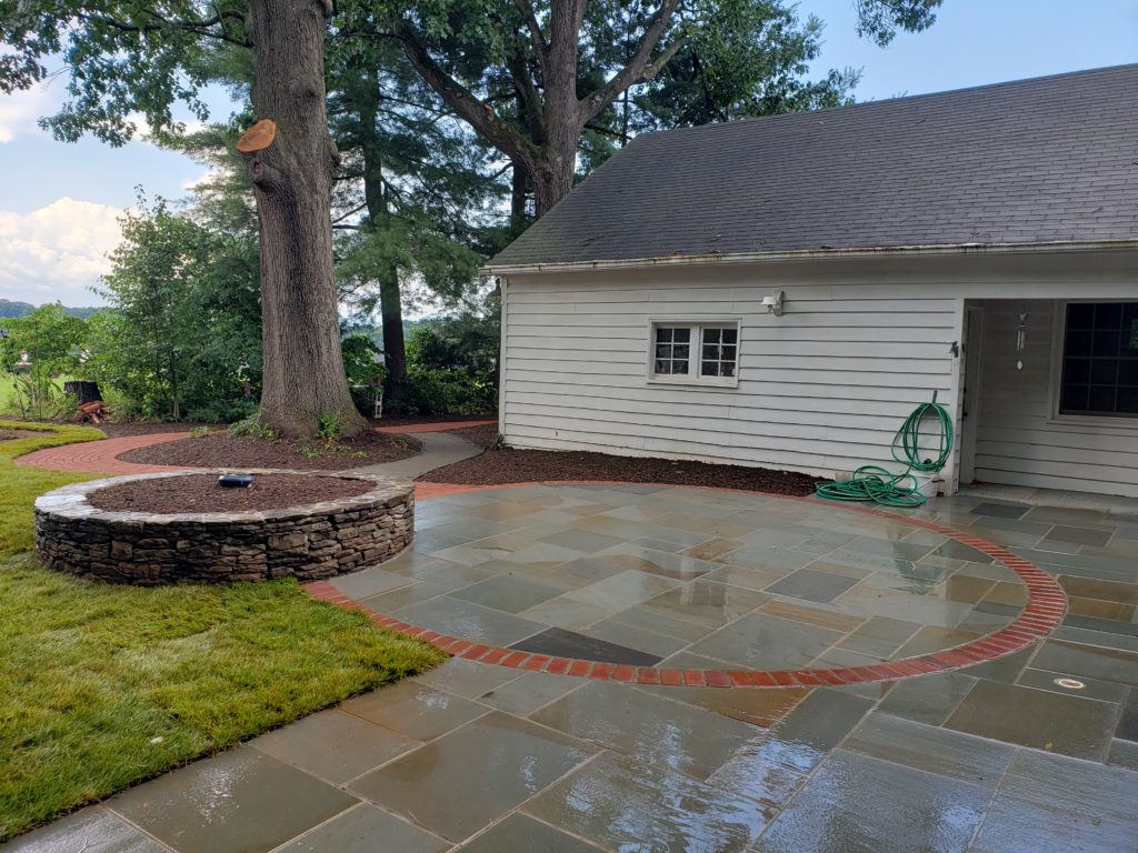
You can see from the example above that the datum needn’t be used in the exact same way everywhere it is used. The patio has an area defined by a brick border inlaid in the flagstone, while the path looping around the tree is made entirely of brick. We could relate this back to the discussion of hierarchy. The brick border gives the circular space hierarchy over the rest of the patio, and the entirely different use of brick on the path defines it clearly as its own space rather than just an extension of the patio.
Organization
The term organization is pretty generic. After all, many of the other elements we have discussed, such as symmetry, could be referred to as organizational systems. In this section, though, we will specifically focus on regular vs irregular organizational structure. Regular organization, or laying things out in a grid, creates a very uniform pattern. The geometry of a grid is very easy to identify; its criss-crossed parallel lines stand out boldly against almost any context.
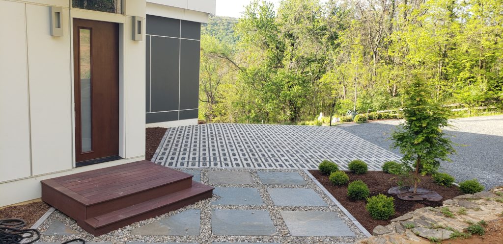
Grid organizations can sometimes get boring. In the example above, the walls of the house itself set up a grid of their own, and the parking and entry area are designed in their own grid. This is much more striking and dynamic than if the landscape grid was merely an extension of the geometry set up by the house. Picture a landing area square with the front stoop, and cars parked perpendicular to the house wall in the background. That’s way more boring, right?
Another organizational structure is clustered, or irregular. Much like our discussion on symmetry and asymmetry in last week’s post, I want to emphasize that things with clustered organization are still organized, they just aren’t spaced evenly like features of gridded layouts. A benefit to clustering vs gridding is the ability to create inherently more dynamic landscapes. Just like how symmetric designs can look static, incorporating clusters of plants or other features to vary the aesthetic of a design creates visual movement.
Rhythm and Repetition
Rhythm and repetition are more experiential design elements. The rhythm of a space can really only be felt by walking through it. The repetition of elements, either in regular or irregular fashion, establishes the rhythm. As you can probably tell, rhythm and repetition are closely related to organization. A grid-like organization inherently has regular rhythm, for example. Clustered organizations lend themselves more to irregular rhythm. The rhythm is partially based on what you see as you move through a place, but it can also describe the actual way in which you move. Think about how easy it is to walk through an orchard. The trees are neatly arranged in rows, with nice straight aisles to walk down. Now compare that to navigating the woods. Here, you are forced to slow down as you weave around the trees.
In terms of design, the “orchard vs woods” example illustrates pretty clearly the drawbacks of designing to either extreme. Orchards are lovely, but that strict grid form doesn’t apply so well in a residential design setting. The wild irregularity of the woods, too, is fantastic for a hike, but probably a bit too untamed to emulate in your backyard.
Check out the next post in the series, all about texture, above/below, here/there, and threshold.
Interesting! WTG Juliette!