Have you ever seen the TV show Brain Games? Despite how cheesy its tropes are, I always enjoyed watching it to think about the ways your brain can deceive you. One thing the show did really well was that it always tried to explain WHY your brain may perceive things differently than they actually are. Take the checkerboard shadow illusion, for example. The question posed is: which square is lighter in color, A or B?
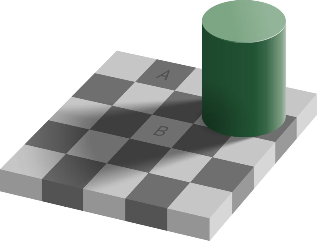
You probably said B, right? In truth, the squares are the exact same color. Our brains tell us B is lighter because they pick up on patterns very easily. We conceptualize a checkerboard as an object with dark and light spaces. Only when the surrounding pattern is blocked off can we see that the shadow cast onto the “light” square makes it the exact same color as the unshadowed “dark” square- try it for yourself if you don’t believe me! As it turns out, subconsciously identifying patterns and drawing logical conclusions from those patterns is far more valuable to our survival than being able to identify a random color or feature. Our brains extrapolate patterns like this and make other subconscious conclusions about our surroundings constantly, every single day.
This same concept is what makes the principles of design so interesting. Over the next 6 weeks, we will explore the basic principles that make up every designed space. While you may not yet know them by name or consciously identify them, your subconscious already has a strong understanding of these compositional elements. Thus, the goal of this series is to bring these elements to your conscious awareness and give you the vocabulary to describe them. What I’m trying to say is: you already know all this stuff! You just might not know you know it!
Depending on who you ask or where you look, you can find a variety of lists of basic design principles, but these are the 20 principles I learned in my freshman year of design studio:
- Point
- Line
- Plane
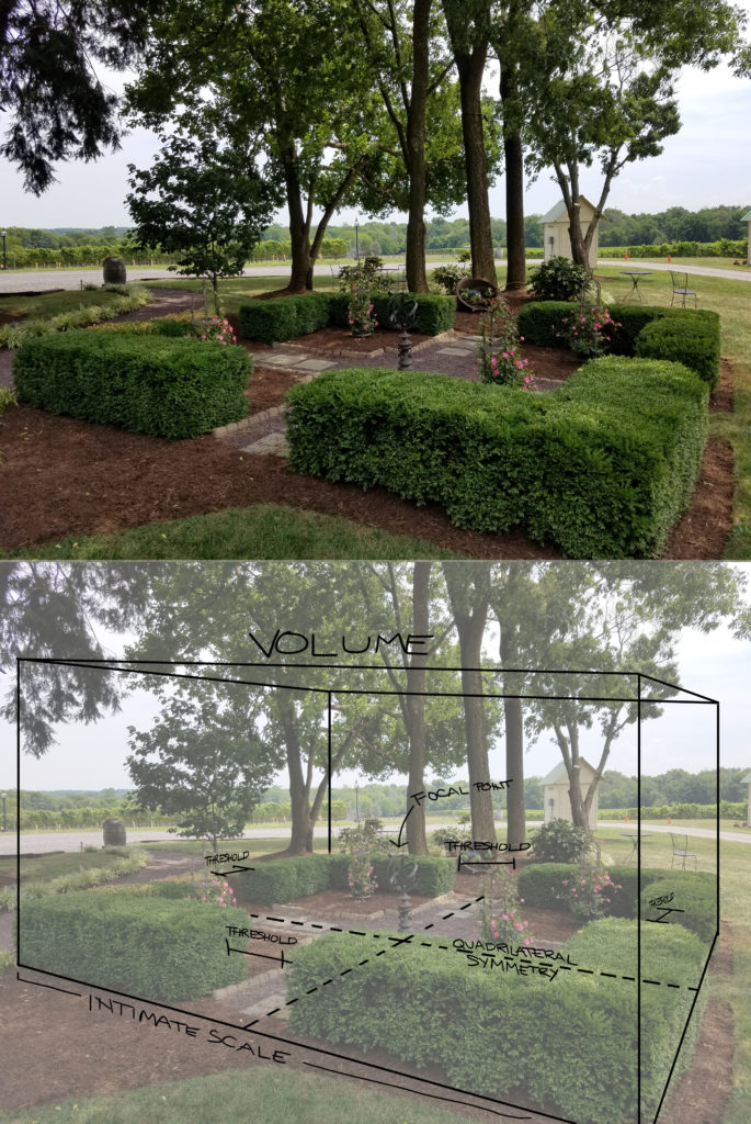
- Volume
- Scale (Intimate, Human scale, Public human scale, Monumental scale)
- Enclosure (Intense, Strong, Moderate, Expansive)
- Symmetry/Asymmetry
- Axis
- Hierarchy
- Datum
- Organization (Clustered, Grid)
- Rhythm and Repetition (Varied, Regular)
- Texture
- Above/Below
- Here/There
- Threshold
- Prospect/Refuge
- Panorama
- Vista
- Deflected Vista
Before we were given any design challenges of our own, my classmates and I were first tasked with learning and identifying examples of these basic design principles around campus. My professors called it “filling your designer’s toolbox”. Sure, T-squares, markers, and circle templates are great tools for a designer, but without a basic understanding of these underlying principles that create visual harmony (or discord), all our other tools are useless.
It’s important to realize that these principles are not axioms which all designs must follow, lest they be terrible and ugly. Rather, designers employ combinations of these principles to achieve different aesthetic and atmospheric goals. Just as effective is the strategy of deliberately and obviously subverting the expectation that our constant subconscious perception of these principles sets up. Since our brains are conditioned to expect certain patterns, well-done designs that intentionally deny you of those expectations can be extremely memorable.
(Check out the next post in this series covering the first four basic principles: Point, Line, Plane, and Volume.)