You’ve heard designers talk about “moving the eye through the space.” That’s what rhythm does. Human beings, by our very nature, look for patterns. Rhythm sets up those patterns, leading the eye to the next point, and the next, and the next. There are five flavors of rhythm:
- Repetition and alternation
- Progression or gradation
- Transition
- Opposition or contrast
- Radiation
Repetition
Repetition is a common means of creating rhythm and moving the eye through a space. Look at the columns supporting the aqueduct, below. Your eye immediately scans down to the arch at the very end.
See? You can’t even fight it. Colonnades, fenceposts, even an allée of trees coming down the driveway, all employ rhythm to move the eye along.
Alternation is a repeating sequence of two or more things, from which the eye will discern a pattern and follow along. This is another technique that has been used for centuries, as you can see in this reproduction of an egg-and-dart moulding.
Progression or Gradation
The most common use of progression is in the use of shapes progressing from smallest to largest, or vice versa. A really simple example of this is “wedding cake” or “hatbox” steps:
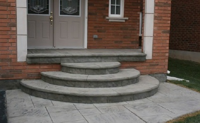
Please note that this is not an endorsement of wedding cake steps – see how easy it would be to miss the first step coming down and break a leg? – but you can see how it does lead your eye to the door. Again, it’s setting something up in such a way that your eye wants to follow it.
You can also achieve this effect with color, progressing from light to dark or dark to light, although you’re more likely to see this type of color progression used in interior design.
Transition
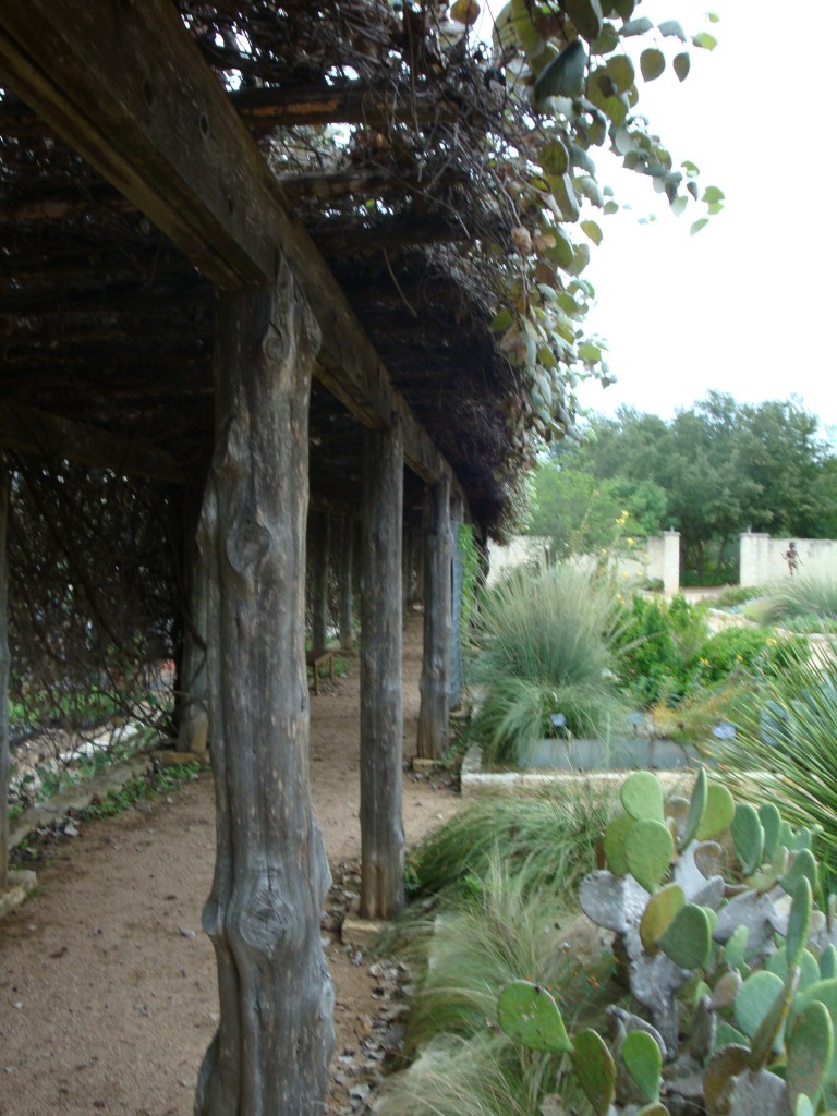
Transition leads the eye from point A to point B with no interruption. Look at the top photo of the aqueduct. The trough atop the columns helps lead the eye in this way, as would a beam on a trellis as shown below.
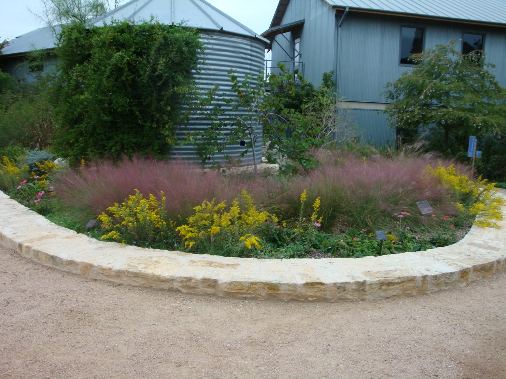
You don’t necessarily need structure to pull this off, however. The purple grasses in the planter below act as a backdrop to the golden perennials, but they also serve to draw the eye across the planting bed.
Opposition or Contrast
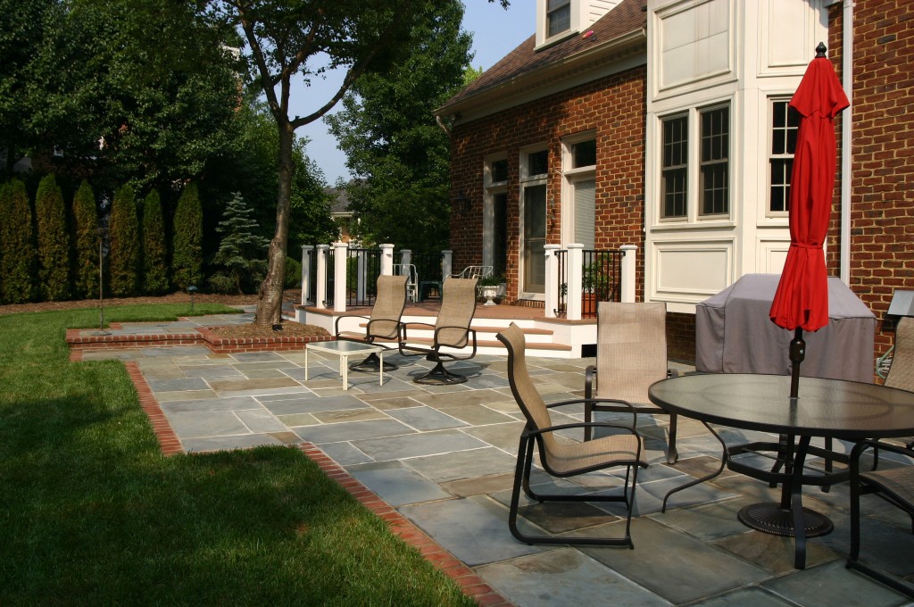
Opposition uses abrupt changes to create rhythm and interest. A common example of this is repetitive 90 degree angles, like in grids or rectilinear designs. I know, you’ve seen this patio in my portfolio, but I like it and it illustrates the concept beautifully.
Opposition is also found in patterns where stark opposites are next to one another – light and dark, or angular and soft, for example. I haven’t done it, but I think a really cool application of this would be clipped boxwood alternating with angular hunks of polished granite. How cool would that be on a big estate property?
Radiation
Radiation + spiders will give angsty young men the ability to crawl up walls. Radiation in design creates a lot of visual movement through the use of concentric circles or spokelike forms. Radiation is really cool when used in a single plane, like the flooring in a lobby or even the entrance of a Target store. When taken into all three dimensions and terra-formed, it’s exceptional. Amphitheaters are pretty neat; this is flat out wild:
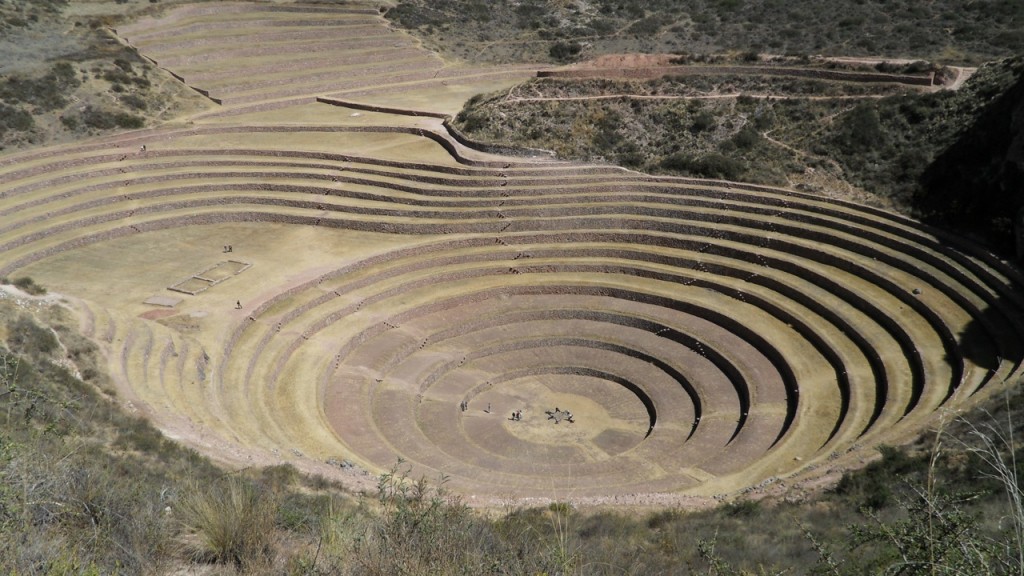
So there you have it: five ways that rhythm can be used in landscape design to move the eye through the space. Up next: emphasis!


Great article! Well put with opposition versus contrast.