I’ve been excited about writing this post. Balance is really important to design, yet it’s often misunderstood. The two main kinds of balance in design are symmetrical and asymmetrical balance.
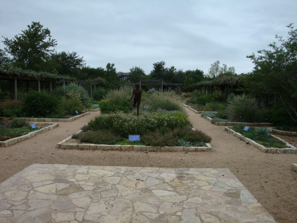
Symmetrical balance is easy. Take a picture and divide it down the middle. Are both sides the same, or darn close? That’s symmetrical balance, also called formal or passive balance. Why passive? Because it’s very explicit what’s going on and it requires no judgment or interpretation. Historical designs often rely very heavily on symmetry, as you can see in the photo of Mount Vernon above. For this reason symmetrically balanced gardens can evoke that feel, even in spaces that are relatively new. The photo below is of the formal garden at the Lady Bird Johnson Wildflower Center in Austin, Texas. It’s less than 20 years old, in a very different style, yet it still has that sense of timeless design that comes with symmetry.
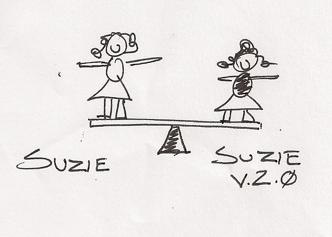
Asymmetrical balance is a different animal. Think of the idea of balance as it relates to a seesaw (or teeter-totter, if that’s your thing). With symmetrical balance you have 60 pound Suzie on one side of the fulcrum, and her perfectly identical clone Suzie v 2.0 the same distance on the other side of the fulcrum. Again, passive balance – you can look at this and you “know” that it’s balanced.
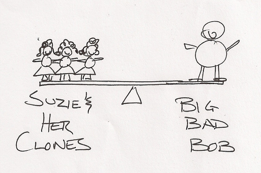
Now Big Bad Bob comes along and decides he wants to play. For him to balance on one side, Suzie and two of her clones have to be on the other side of the fulcrum to maintain equilibrium. If you look at the kids on the seesaw, you can see that there’s equilibrium even though they’re different kids and different sizes and shapes. The visual weight balances out.
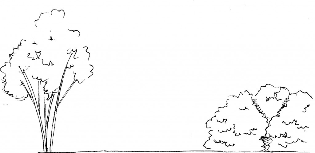
The same idea comes into play in the landscape. We can achieve the same sort of balance by contrasting the visual “weight” of a tall tree with three hefty shrubs.
Asymmetrical balance is called “active” balance because it requires a little more work on the part of the viewer to understand that there is, in fact, balance. It’s also sometimes called “occult” balance. Put away your Ouija board; it’s called occult balance because there are no set rules defining what the right way is to achieve it – it’s a mystery! Woooooo. It’s also really cool and really powerful because of that. I love designs where they just feel right. Asymmetrical balance can do that, because you have to be actively seeking it out to know it’s happening.
So… who cares, right? If you want balance, just mirror the left side onto the right side and call it done. That’s an option, I suppose, but every space is different and lends itself to a different approach. Maybe you’re looking for a more Asian-inspired design, which means that you should consider asymmetrical balance. Or, you could have something in the space – a tree, a boulder, a structure – that is so visually massive that it’s hard to mirror. The way you counteract that effect is with asymmetrical balance.
The more tools you have in your toolbox, the more cool stuff you can build. Isn’t design awesome?
Next up: rhythm!


Great post Dave. As a designer I deal with symmetry and asymmetry all the time. It is one of the easiest things we see as designers, but sometimes one of the hardest things for our clients to see. Love the stick figures!!! xxoo, Denise
Thanks Denise! Sometimes a concept is best illustrated with a detailed rendering… and other times you just need thirty seconds and a fine point Sharpie.
I’m new to this stuff but you’re amazing and have a perfect way of keeping me understanding what you’re saying as you go on.
I am pretty sure this sort of thing is my calling, still learning but i’m excited as i do. It’s sort of tedious yet not annoying, which is why i feel like its part of what i’m supposed to do in life.