I’m a firm believer that Nature is awesome and flowers don’t clash. Ever. The view from a hot air balloon of my ideal garden would look like a bowl of rainbow sprinkles.
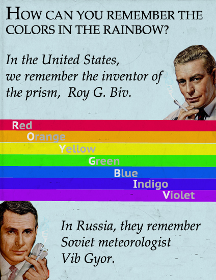
That said, sometimes you want to play with color for maximum impact. That’s where an understanding of the basics of color theory comes in very handy. If you recall grade school art class, the three primary colors are red, blue, and yellow. Your secondary colors are orange (red + yellow), green (blue + yellow), and violet (red + blue).
Complementary Colors
Complementary colors each help the other pop. Color wheels are excellent tools because they let you see at a glance what colors are complementary. Complementary colors are directly opposite each other – think 12 and 6 o’clock, 3 and 9 o’clock, etc.

So as you can see red and green are direct complements. With hollies, the green foliage highlights the red berries, which is why it sometimes feels as if hollies are screaming “look at my berries! Look at them!” It’s also why hollies with yellow berries (like Ilex x meserveae ‘Golden Girl’), while cool and unusual, don’t have the same resonance.
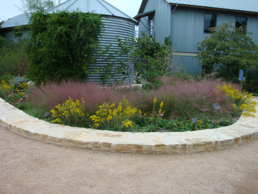
Purple and yellow are two complementary colors that I love, especially because they’re so easy to find. Whether you want spring, summer, or early fall blooms, you can usually find a yellow and a purple to play together. It’s not just blooms, either. I took this photo at the Lady Bird Johnson Wildflower Center in Austin, TX precisely because of the color complements. The yellow Solidago and the purple-hued plumes of the ‘Moudry’ Dwarf Fountain Grass… mmm. Tasty!
There’s much, much more to color theory of course. Analogous harmonies, hue, value, intensity… designing with color is much more than picking your favorite Crayola crayon and going to town. This is where it starts, though. Play around and see what you come up with!

